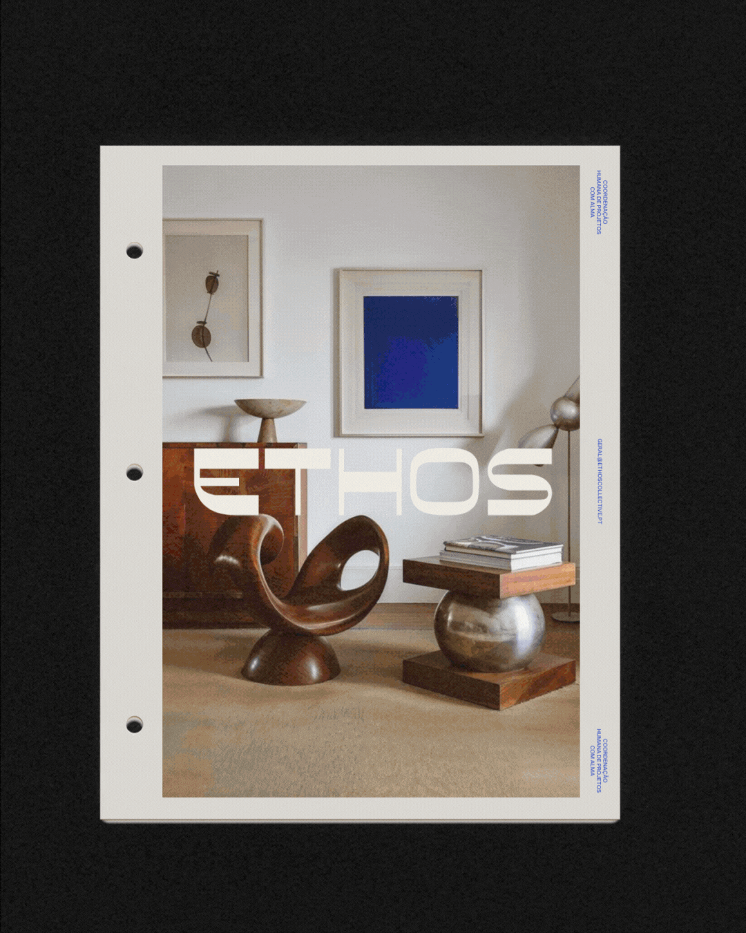
ETHOS
Ethos is a human-centered project coordination studio. A new way of working in architecture, design, and construction.
Born from the need for clarity, alignment, and emotional intelligence in the built environment, Ethos curates teams, bridges communication, and holds space for people to work with trust, autonomy, and purpose.
It’s not an agency. It’s not a platform. It’s a collective. Of professionals, clients and values. Building a new culture around how projects are made: with structure, and with soul.
CLIENT
Ethos Collective
SERVICES
Brand strategy and positioning
Brand narrative and storytelling
Tone of voice and messaging
Visual identity development
Color palette and typography system
Content strategy and social media guidelines
DATE
October, 2025
WEBSITE
coming soon

CONCEPT
ETHOS
& STRATEGY
Ethos was created by people who lived the noise, pressure, and disconnection of traditional project work. The studio emerged as a response, and as a proposal: what if projects could feel lighter, more aligned, and deeply human?
The strategy is simple but powerful. Build bridges between clients and professionals, clarify roles and expectations, and support teams so everyone can do their best work with less friction and more flow.


CONCEPT
ETHOS
CONCEPT
Ethos acts as a curator and a mediator. It matches clients with professionals from a trusted network and stays present throughout the process. Not to interfere, but to ensure structure, alignment and care.
Two paths, one Ethos:
Clients find clarity, commitment and a team they can trust.
Professionals find autonomy, meaningful work and better conditions.
By supporting both sides, Ethos creates projects that run better because people feel better.


BRAND
ETHOS
VISUAL IDENTITY
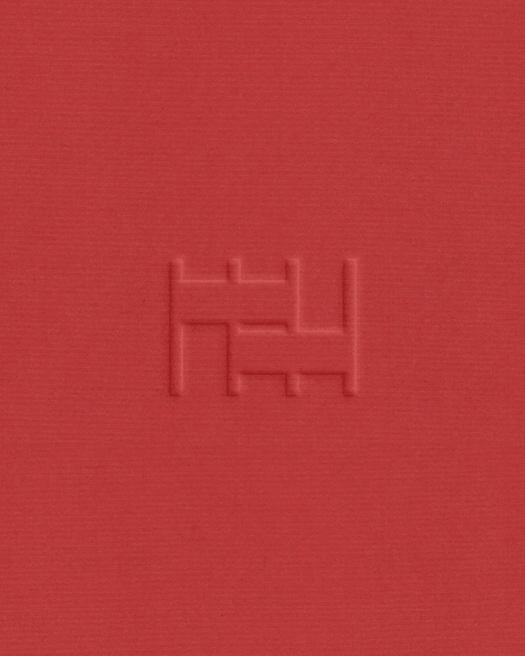
The visual identity of ETHOS is design-driven, architectural, and bold. A blend of brutalist influence with sharp modernity.
The typographic system balances refined precision with personality, combining Director Light and Switzer to create strong contrasts between statement and detail. Color is used intentionally: deep reds, matte blues, and warm neutrals bring clarity, structure, and emotion into every composition.

BRAND
EVERKIND
VISUAL IDENTITY
A graphic language rooted in grid logic and minimal forms allows the brand to feel simultaneously rigorous and expressive.
A mirror of ETHOS’ mission to combine empathy with efficiency, and humanity with process. The result is an identity that feels distinct, credible and contemporary. Fit for a collective that’s quietly changing how things get done.