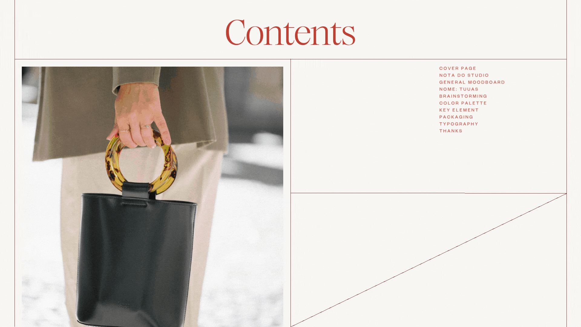
ISAGA
Isaga is a contemporary Portuguese handbag brand, born in the heart of Lisbon and deeply connected to the heritage of the iconic Sapataria do Carmo. Founded by Sofia Lourinho, Isaga is a love letter to craftsmanship, timeless design, and the small details that make all the difference.
Each piece is designed with a modern yet classic vision, inspired by the city’s light, architecture, and understated charm, while reflecting a personal journey of passion, creativity, and dedication to quality. Isaga handbags are made for women who value both elegance and individuality, with thoughtful touches that turn everyday accessories into objects of desire.
Designed in Lisbon. Made for everywhere.
CLIENT
Isaga
SERVICES
Brand strategy and positioning
Brand narrative and storytelling
Tone of voice and messaging
Visual identity development
Color palette and typography system
Content strategy and social media guidelines
Website design and development (Shopify)
Visual direction and art direction for photography
Retail and in-store visual merchandising guidelines
Launch and campaign strategy
DATE
November, 2024
WEBSITE
isaga.pt

CONCEPT
ISAGA
& STRATEGY
The brand strategy for Isaga was built on the idea of creating timeless yet unexpected pieces that reflect both the brand’s roots and its forward-thinking attitude. Drawing on the existing logo and monogram, we crafted a new visual and storytelling layer that celebrates the elegance of Lisbon while positioning Isaga as an elevated, design-led brand.
A key strategic decision was to link the brand closely to the city, using Lisbon not just as inspiration but as a core element of the narrative. This is reflected in every touchpoint: from content to design, from copy to photography. The tone is sophisticated but accessible, blending classic aesthetics with bold, contemporary execution.
To amplify the relaunch, we developed a comprehensive brand storytelling approach, a content strategy deeply rooted in lifestyle, craftsmanship, and the beauty of the unexpected. We also designed and implemented the full Shopify website, ensuring the online experience matched the refined and elevated tone of the brand, with a seamless, intuitive and highly visual interface.


CONCEPT
ISAGA
VISUAL IDENTITY
The visual identity of Isaga reflects a perfect balance between classic refinement and bold modernity. The serif typography brings timeless elegance, while oversized layouts and impactful messaging give the brand a contemporary, fashion-forward edge.
The color palette is soft, neutral, and sophisticated, allowing the bags and their textures to stand out. The use of strong editorial photography, mixing lifestyle and product shots, conveys the brand’s understated luxury and effortless allure.
The visual system is flexible yet coherent, designed to live across multiple platforms, from the website to social media, always with consistency and personality.


BRAND
ISAGA
PURPOSE


At Isaga, we believe in the beauty of the small things, the details that transform the ordinary into the extraordinary. The brand purpose is to create timeless pieces that inspire women to express themselves with elegance, simplicity, and confidence.
Born in Lisbon but made for everywhere, each Isaga handbag is an invitation to discover the world with style, authenticity, and a touch of the unexpected.